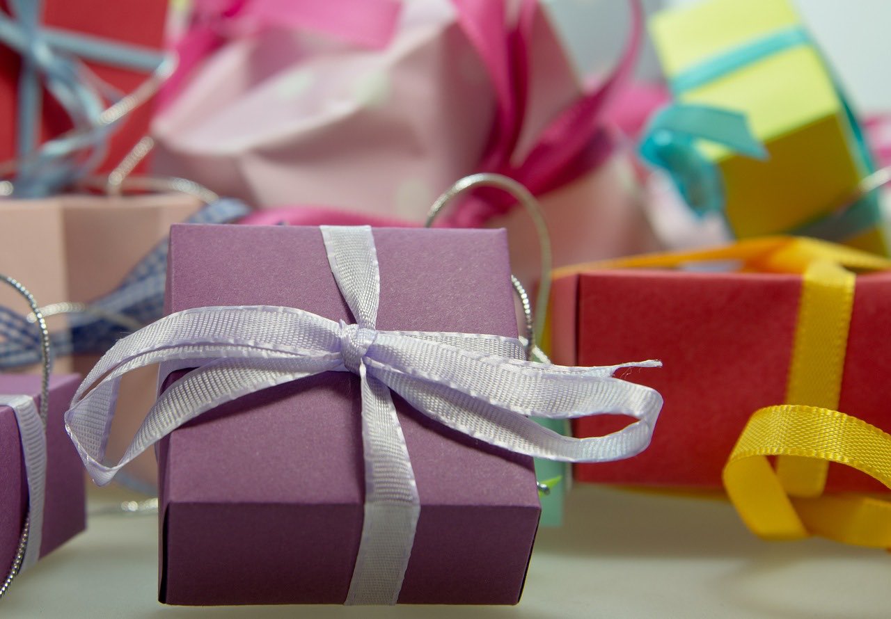
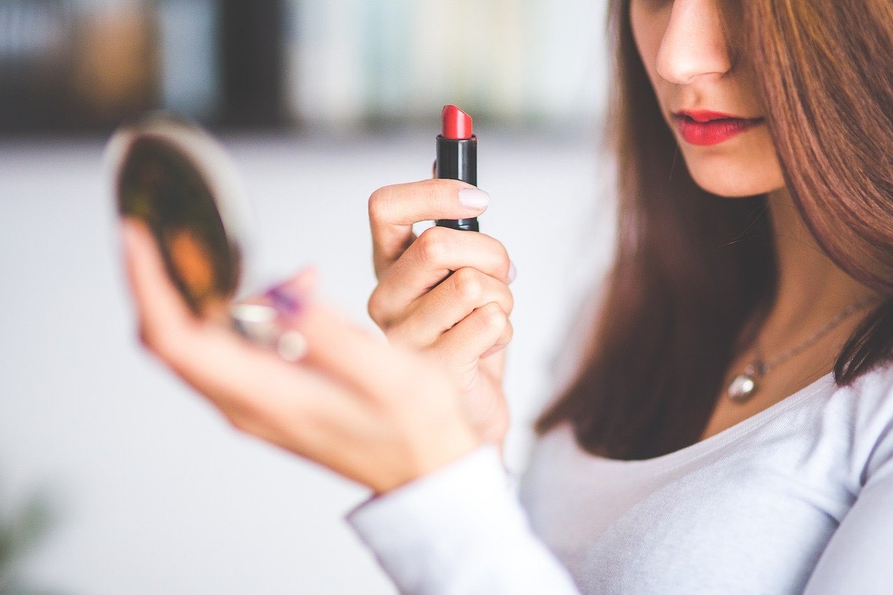
One of the most important parts of a product is how it is packaged. Packaging can help to show off the uniqueness of a company, while also helping them to boost their sales. Whether you get custom packing by Deepking or go another direction, your packaging needs to excite and entice the customer and provide them with a good feeling. This is especially true in industries like beauty. The potential to develop loyal customers is greater in the beauty industry than almost anywhere else.
Once these customers find a product they like, they will generally stick with it and buy it often. As a result, a company in the space needs its packaging to jump off the shelf and attract the attention of shoppers in one way or another. This article is going to take a closer look at 5 beauty brands that have incredible packaging for their products.
Glossier
Glossier is a company that prides themselves on their incredibly simple and minimal design on many of their beauty products. The labels on their products are generally white or very subtle colours, with bold and black typography on top. There isn’t any major detail, extra designs or anything else on the packaging in most cases. This minimalist design is growing in popularity, and it is easy to see why as it looks very elegant. While some customers certainly prefer abstract and colourful packaging, there are some who will connect more with something that is simple and to the point.
Ethique
Another beauty brand that has really stepped up when it comes to packaging is Ethique. The designs they use are bright, colourful and fun. They elicit a sense of excitement and curiosity, as well as being very unique. In addition to looking good, the packaging used by Ethique is also free from plastic. Plastic pollution is a huge problem, so the less plastic that is used, the better. Ethique uses recycled paper for all of their bar products and also donates money to protect our environment. This packaging speaks to a generation that cares about sustainability and wants to support companies that do as well.
Kjaer Weis
When it comes to modern beauty product package design, you would be hard pressed to find one more impressive than Kjaer Weis. They have not only a very unique shape, but also a unique metallic look and feel. There is also very little text or imagery to speak of in their design. Instead, their sleek logo appears on nearly every product. They do a great job at making something that most customers have never seen before, without making it too over the top and unfamiliar.
Kevin Murphy
The beauty of the packaging when it comes to Kevin Murphy products is all about the shape. Most of their products come in geometric shapes with sleek lines such as squares, rectangles, hexagons and others. This not only separates it from many of the other products but also helps them be shipped and stored more efficiently. In addition to the shape, the colours of the packaging is also a win. They come in a variety of unique colours, in shades that you don’t often see. The packages also provide a good amount of information, without taking away from the overall design.
Kaleidos
The name of the game when it comes to packaging for this makeup company is colour and abstract design. Many of their products feature a plentiful amount of incredibly vibrant colours, and attractive designs both inside and out. Also, the shape of many of their products, such as their highlighters, are quite different and will surely stand out. Few products on store shelves will catch your eye as naturally or as easily as these products.
In conclusion, these aforementioned beauty brands have some of the most incredible packagings in the industry.

